You spent hours building your handyman website. Maybe you paid someone to design it, or you cobbled it together yourself using a website builder. It looks decent enough. You’ve got pages for your services, some photos, and your contact information is somewhere on there.
But here’s the problem: your phone isn’t ringing. Your contact form sits empty. You’re getting website visitors, you can see it in your analytics but they’re not becoming customers. They land on your site, look around for a few seconds, and disappear without calling, texting, or booking a service.
Every visitor who leaves without contacting you represents lost revenue. If your site gets 100 visitors a month and the average handyman job is worth $350, even a modest 5% conversion rate should generate $1,750 in monthly revenue. But if your conversion rate is stuck at 1% because of easily fixable problems, you’re leaving $1,400 on the table every single month. That’s nearly $17,000 per year.
The difference between a website that converts at 1% versus 5% isn’t luck. It’s not about having flashier graphics or more expensive hosting. It’s about understanding exactly why visitors leave without converting and systematically fixing each conversion killer.
Navigate This Post
7 Critical Mistakes Killing Your Handyman Website Conversions
1. Hidden or Hard-to-Find Contact Information
Picture this: A homeowner has a leaky faucet. Water is dripping. They’re frustrated. They Google “handyman near me,” land on your website, and want to call you right now. But they can’t find your phone number. It’s buried in the footer in tiny text, or worse, hidden on a separate “Contact Us” page they need to hunt for.
That homeowner isn’t going to dig through your site like they’re on a treasure hunt. They’ll hit the back button and call the next handyman whose number is prominently displayed.
Why this kills conversions: When someone is ready to hire a handyman, they’re often dealing with an urgent problem. They want immediate help. If you make them work to contact you, they’ll find someone who makes it easier.
The fix: Your phone number should appear in multiple places on every page:
- In the header of your website (top right corner works best)
- As a sticky button that follows users as they scroll
- At the end of every service description
- In your footer
But here’s what really moves the needle: make your contact information tap-to-action on mobile devices. When someone clicks your phone number on their smartphone, it should immediately start a call. When they click your contact button, it should offer options to call, text, or get directions. Remove every possible barrier between “interested visitor” and “paying customer.”
2. No Clear Call-to-Action (CTA)
Many handyman websites suffer from CTA confusion. You visit the site and see buttons that say “Learn More,” “Contact Us,” “Get Information,” and “Submit.” Which one should you click? What happens when you click it? What’s the difference between them?
When visitors face too many choices or unclear options, they freeze. It’s called decision paralysis, and it’s costing you jobs.
Why this kills conversions: Your website visitors shouldn’t have to think hard about what to do next. If your CTA buttons are vague, inconsistent, or overwhelming in number, people will simply leave rather than figure it out.
The fix: Every page on your site should have one primary action you want visitors to take. For most handyman businesses, that’s either “Call Now” or “Book Service.” Your CTA buttons should use action-oriented language that tells people exactly what will happen:
- “Call for Same-Day Service” (not just “Contact”)
- “Get Your Free Quote” (not just “Submit”)
- “Schedule Your Repair” (not just “Book Now”)
The best-converting handyman websites offer a dual conversion path: an instant booking option for straightforward jobs like TV mounting or furniture assembly, and a “Request Custom Quote” option for projects that need discussion first. This accommodates different customer preferences while keeping the path forward crystal clear.
Place your primary CTA prominently in your hero section (the first thing visitors see), repeat it after each service description, and include it in a sticky header that stays visible as people scroll.
3. Outdated Design That Screams “Is This Business Still Operating?”
First impressions matter, and they happen fast. Research shows that visitors form an opinion about your website in just 50 milliseconds. If your site looks like it was built in 2010 with outdated fonts, clashing colors, busy backgrounds, or that classic “under construction” vibe people will assume your business is outdated too.
Why this kills conversions: Your website is often the first interaction potential customers have with your business. An outdated or unprofessional design erodes trust before you even have a chance to showcase your skills. Visitors think: “If they can’t maintain a decent website, how will they maintain my home?”
The fix: You don’t need a cutting-edge, award-winning design. You need a clean, professional, modern website that looks like it belongs in 2025. This means:
- Mobile-responsive design that works perfectly on phones and tablets
- A clean, uncluttered layout with plenty of white space
- Professional (not pixelated) images
- Consistent branding with a simple color palette
- Modern fonts that are easy to read
- Fast loading times without janky page jumps
Think of your website as your digital storefront. You wouldn’t show up to a client’s home in a beat-up truck with rust and missing bumpers. Your website deserves the same level of presentation as your in-person appearance. The message you send with a polished website is clear: you care about details and professionalism.
4. Missing or Vague Service Area Information
“Serving the Greater Metropolitan Area.” “Proudly Serving the Community.” “Your Local Handyman.”
These vague phrases tell potential customers exactly nothing. A homeowner in Lakewood searching for a handyman doesn’t know if you actually serve Lakewood or if you’re three counties away with a loose definition of “local.”
Why this kills conversions: Handyman services are inherently local. If visitors can’t immediately confirm you serve their area, they won’t waste time finding out. They’ll move on to a competitor whose service area is explicitly stated.
The fix: Be specific about where you work. Create dedicated service area pages for each city or neighborhood you serve. These pages should include:
- The specific city or neighborhood name in the page title and URL
- A clear statement: “We provide handyman services throughout [City Name]”
- Neighborhoods or zip codes within that city
- Approximate response times for that area
For your homepage, include a simple statement like: “Serving Denver, Lakewood, Arvada, and Westminster” with links to each city page. This not only helps with conversions but also dramatically improves your local SEO. When someone searches “handyman Lakewood CO,” you want Google to see clear signals that you serve Lakewood specifically.
If you serve a 20-mile radius, say that. If you focus on specific neighborhoods, list them. Remove the guesswork.
5. Generic Stock Photos Instead of Real Work
Nothing says “I don’t actually do this work” quite like stock photos of models in clean clothes holding tools they clearly don’t know how to use. You know the ones perfectly staged scenarios with impossibly clean workspaces and actors pretending to install a light fixture.
Meanwhile, your competitors are showing real before-and-after photos of actual jobs they completed last week.
Why this kills conversions: Trust is everything in the handyman business. You’re asking homeowners to let you into their houses and trust you with their property. Stock photos don’t build trust they destroy it. They signal that you either haven’t done enough work to have real photos or you’re trying to hide the quality of your actual work.
The fix: Invest in a decent smartphone (you probably already have one) and start photographing every job. You don’t need professional photography you need authentic documentation of your work. Create a photo gallery showcasing:
- Before-and-after transformations
- Completed projects from multiple angles
- Details of your craftsmanship
- You and your team aare ctually working (if you’re comfortable being photographed)
Organize your gallery by project type (deck repairs, drywall patching, door installation, etc.) so visitors can easily find examples relevant to their needs. These real photos accomplish two things: they prove you actually do quality work, and they help potential customers visualize what you could do for them.
Add a photo of yourself, too homeowners want to know who’s showing up at their door. A friendly, professional headshot with a brief introduction builds connection and trust.
6. Slow Loading Speed (The Silent Lead Killer)
Your website might look great on your office computer with its fast internet connection. But when a potential customer tries to load it on their phone while dealing with a broken toilet at 7 PM, your beautiful 5MB hero image takes 12 seconds to load. They’re not waiting. They’re gone.
Why this kills conversions: Google research shows that 53% of mobile users abandon sites that take longer than 3 seconds to load. Every additional second of load time can reduce conversions by 7%. If your site takes 5 seconds to load instead of 2 seconds, you could be losing 20% of your potential customers before they even see your content.
Speed impacts more than just conversions it also affects your search rankings. Google explicitly uses page speed as a ranking factor, meaning slow sites rank lower in search results, which means fewer visitors in the first place.
The fix: Run your website through Google’s PageSpeed Insights or GTmetrix to identify specific speed issues. Common problems include:
- Oversized images that haven’t been compressed
- Too many plugins or scripts are loading at once
- Poor hosting with slow server response times
- Unoptimized code or render-blocking resources
For most handyman websites, the biggest quick win is image optimization. That 4MB photo you uploaded straight from your phone should be resized and compressed to under 200KB without noticeable quality loss. Tools like TinyPNG or built-in optimization in website builders can handle this automatically.
If your hosting is cheap ($5/month shared hosting), it might be worth upgrading to better hosting. The difference in cost ($20-40/month) is negligible compared to the revenue you’re losing from slow load times.
7. Zero Social Proof or Customer Reviews
You’re scrolling through a handyman’s website. The services look good. The prices seem fair. But there’s not a single customer review, testimonial, or rating anywhere on the site. Would you call this person to work on your home? Or would you look for someone with proven results and happy customers?
Why this kills conversions: In the age of online reviews, the absence of social proof is almost more damaging than negative reviews. It raises questions: Is this business new? Do they have unhappy customers? Are they hiding something? People trust other people’s experiences more than any marketing copy you could write.
Research from BrightLocal shows that 98% of consumers read online reviews for local businesses, and 76% trust reviews as much as personal recommendations. If your website doesn’t showcase this social proof, you’re fighting an uphill battle.
The fix: Make reviews and testimonials prominent throughout your website:
Embed your Google reviews directly on your homepage using Google’s review widget. This shows real, unfiltered feedback and includes your star rating.
Create a dedicated testimonials page with detailed customer stories, including:
- The customer’s name and location (with permission)
- The specific job you completed
- Their experience working with you
- Results or outcomes
Feature rotating testimonials on your homepage with photos of the completed work when possible.
Display trust badges like “A+ BBB Rating” or “500+ 5-Star Reviews” if applicable.
But here’s the critical part: you need to actively collect reviews. After every successful job, send a follow-up text or email asking satisfied customers to leave a review on Google. Make it easy with a direct link. Many handymen see a 30-40% review rate just by asking consistently.
If you’re just starting and don’t have many reviews yet, be honest about it. Feature testimonials from your first customers with context: “Here’s what our early customers are saying.” Authenticity matters more than volume in the beginning.
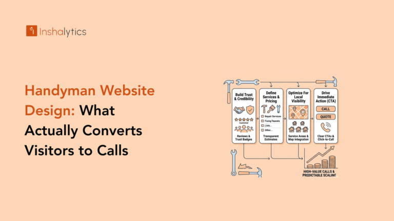
What High-Converting Handyman Websites Do Differently?
The top-performing handyman websites aren’t just avoiding mistakes they’re proactively optimizing for conversions at every step. Let’s look at what separates a 1% conversion rate from a 5-7% conversion rate.
They Make Booking Effortless
The best handyman websites eliminate friction in the booking process. Instead of forcing potential customers to fill out a lengthy contact form and wait for a callback, they offer multiple easy paths to conversion.
Instant online scheduling systems allow customers to choose a service, pick a time slot, and confirm their appointment without any back-and-forth. This works especially well for straightforward services like furniture assembly, TV mounting, or basic repairs where pricing is standardized.
Click-to-call and click-to-text buttons make mobile contact instant. When someone taps your phone number on their smartphone, their phone app opens immediately to start a call. A text option lets less urgent customers reach out without the commitment of a phone call.
Two-path conversion strategy accommodates different customer preferences:
- Fast path: “Book Standard Services Now” with instant scheduling
- Custom path: “Request a Quote for Custom Projects” with a simple form
The key is letting customers choose their preferred way to contact you, not forcing everyone through the same funnel.
They Pre-Qualify Premium Clients
This might sound counterintuitive, but the best-converting handyman websites actually repel some visitors on purpose. They design their site to attract premium customers willing to pay professional rates while filtering out tire-kickers looking for the cheapest option.
How do they do this?
Professional presentation signals premium service. Clean design, quality photos, and polished copy communicate that you’re not the bargain option you’re the quality option.
Clear service standards like “2-hour minimum” or “Starting at $150” help price-sensitive shoppers self-select out before wasting your time with phone calls.
Emphasis on expertise and reliability over “cheap” or “budget.” The language focuses on quality, experience, and professionalism rather than competing on price.
The result? Fewer total leads, but higher-quality leads that convert at better rates and accept your pricing without constant negotiation. This approach dramatically improves your ROI because you’re spending less time qualifying leads and more time completing profitable jobs.
They Optimize for Mobile-First Users
Here’s a stat that should change how you think about your website: approximately 85% of people searching for local services do so on mobile devices. If your website isn’t built with mobile users as the primary audience, you’re essentially ignoring 85% of your potential customers.
Mobile optimization goes beyond just making your site “work” on phones. It means designing specifically for the mobile experience:
Thumb-zone optimization: Primary action buttons are placed in the bottom third of the screen where thumbs naturally rest, making them easy to tap without stretching.
Large, tappable buttons: CTAs are at least 44×44 pixels (Apple’s recommended minimum) so they’re easy to tap without accidentally hitting adjacent elements.
Minimal typing required: Forms are short and use mobile-friendly inputs like dropdown menus and autofill-compatible fields.
Fast loading on cellular connections: Images and resources are optimized for 3G/4G speeds, not just WiFi.
Click-to-call prominently placed: The phone number is always visible and instantly callable with one tap.
Test your website on your own phone regularly. Can you easily accomplish the main goal (calling or booking) within 10 seconds? If not, your mobile experience needs work.
They Answer Questions Before They’re Asked
Converting visitors requires addressing their concerns proactively. The highest-converting handyman websites anticipate common questions and answer them throughout the site, eliminating reasons for hesitation.
Service-specific landing pages go deep on individual services rather than just listing them. A dedicated “Drywall Repair” page might include:
- Common drywall issues you fix
- Your repair process step-by-step
- Typical project timelines
- Average price ranges
- Photos of completed drywall repairs
- FAQs specific to drywall work
Comprehensive FAQ sections address the real concerns people have:
- “Do you provide free estimates?”
- “How quickly can you schedule service?”
- “Are you licensed and insured?”
- “What if I’m not satisfied with the work?”
- “Do I need to provide materials, or do you?”
Transparent pricing information (when possible) helps customers self-qualify and reduces friction. Even if you can’t give exact prices, providing ranges or starting prices helps set expectations.
The goal is to remove every possible objection or uncertainty that might prevent someone from contacting you. The more questions you answer upfront, the more qualified and ready-to-book your leads become.
The Conversion-Focused Website Checklist
Use this checklist to audit your current website or build your next one with conversions in mind:
Contact & Conversion Elements:
- Phone number visible in header on every page
- Click-to-call and click-to-text enabled on mobile
- Clear primary CTA above the fold
- Secondary CTA repeated throughout the page
- Contact form with minimal required fields (3-5 max)
- Online booking option for standard services
- Multiple ways to get in touch (call, text, form, booking)
Trust & Credibility:
- Real photos of completed work (not stock images)
- Before-and-after project gallery
- Google reviews embedded or linked
- Customer testimonials with names and locations
- Your photo and brief bio
- License/insurance information clearly stated
- Years of experience or number of completed jobs
Local SEO Elements:
- Specific cities/neighborhoods served clearly listed
- Dedicated service area pages for each location
- Google Business Profile claimed and optimized
- Address and phone number on every page
- City-specific keywords in content naturally
Technical Performance:
- Mobile-responsive design that works on all devices
- Page load time under 3 seconds
- All images optimized and compressed
- No broken links or 404 errors
- SSL certificate (https://) installed
- Works properly in all major browsers
Content & Information:
- Service list with descriptions and pricing guidance
- FAQ section addressing common concerns
- Service area information is prominent
- Blog or resources (optional but helpful for SEO)
- Clear about the page explaining who you are
- Explanation of your process or what to expect
Design & User Experience:
- Professional, modern design (not outdated)
- Clean layout with plenty of white space
- Easy-to-read fonts and text sizes
- Consistent branding and colors
- Intuitive navigation menu
- Visual hierarchy that guides attention
- No auto-playing videos or music
Go through this checklist honestly. Every missing checkbox represents a potential conversion leak costing you jobs.
How Much Revenue Is Your Current Website Costing You?
Let’s do some quick math to understand the financial impact of a poorly converting website.
Step 1: Calculate your current situation
- Monthly website visitors: _____ (check your analytics)
- Current conversion rate: _____ (form submissions + calls ÷ visitors)
- Average job value: $_____
- Current monthly revenue from website: _____ visitors × _____ % × $_____ = $_____
Step 2: Calculate your potential with a 5% conversion rate
- Same monthly visitors: _____
- Improved conversion rate: 5%
- Same average job value: $_____
- Potential monthly revenue: _____ visitors × 5% × $_____ = $_____
Step 3: Calculate the opportunity cost
- Potential revenue – Current revenue = Monthly loss
- Monthly loss × 12 = Annual opportunity cost
Let’s use a realistic example:
- 150 monthly visitors
- Current 1.5% conversion rate (2-3 leads/month)
- $400 average job value
Current: 150 × 1.5% × $400 = $900/month ($10,800/year)
Potential at 5%: 150 × 5% × $400 = $3,000/month ($36,000/year)
Opportunity cost: $25,200 per year
That’s over $25,000 in annual revenue you’re leaving on the table because of website conversion problems. Now consider the lifetime value of those lost customers the repeat business, referrals, and reviews you never got.
Even if improving your conversion rate from 1.5% to 5% costs $3,000-5,000 in website investment, it pays for itself in the first month and generates an additional $25,000+ every year after that.
From DIY Disaster to Lead-Generating Machine: Your Next Steps
If you’ve recognized your website in these conversion killers, don’t panic. Every problem we’ve covered is fixable. Here’s how to move forward based on your current situation.
Quick Wins You Can Implement Today
These changes require minimal technical skill and can improve conversions immediately:
- Add your phone number to your header in a large, clickable format
- Write better CTA button copy that tells people exactly what happens when they click
- Add a simple contact form to your homepage with just name, phone, email, and service needed
- Take photos of your next 5 jobs and add them to your website
- Send follow-up texts to your last 10 customers asking for Google reviews
- List the specific cities you serve prominently on your homepage
- Run a speed test and compress any images over 500KB
These changes alone could lift your conversion rate by 1-2 percentage points, translating to thousands in additional revenue.
Medium-Term Improvements (Next 30-60 Days)
Once you’ve handled the quick wins, focus on these more substantial improvements:
- Create dedicated service pages for each of your main offerings
- Build a project gallery organized by service type with before-and-after photos
- Implement an online booking system for standard services
- Optimize your site for mobile with a responsive design if you haven’t already
- Create service area pages for each city or neighborhood you serve
- Add a comprehensive FAQ section addressing all common customer concerns
- Set up review automation to request Google reviews after each job
These improvements require more time or investment but create lasting conversion improvements.
When to Invest in Professional Help?
Here’s the reality: building a high-converting handyman website requires skills in design, copywriting, technical optimization, local SEO, and conversion rate optimization. Few handymen have expertise in all these areas and that’s okay. Your expertise is in fixing homes, not building websites.
Consider professional help when:
- You’re technically overwhelmed by website platforms and don’t enjoy learning them
- You’ve tried DIY approaches, but your conversion rate remains stubbornly low
- Your time is worth more completing $50-75/hour handyman jobs than learning web development
- You need integrated solutions like booking systems, CRM, and review automation
- You want consistent results rather than guesswork and trial-and-error
The right marketing partner doesn’t just build you a prettier website they create a complete lead generation system that captures visitors, converts them into leads, and helps you manage those leads efficiently.
At Inshalytics, we specialize in building conversion-optimized websites and comprehensive marketing systems for service businesses like yours. We handle everything from website design and local SEO to review automation and content marketing all the elements we’ve discussed in this article so you can focus on what you do best: quality handyman work.
For $500 per month, we provide complete marketing services including a high-converting website, local SEO, review management, and ongoing optimization. It’s less than the cost of losing two potential customers per month to website conversion problems.
Your Conversion Optimization Action Plan
Here’s your step-by-step plan moving forward:
Week 1: Implement all the quick wins listed above. Focus on contact information visibility, better CTAs, and adding real photos.
Week 2: Audit your website against the conversion checklist. Identify your biggest gaps and prioritize fixing them.
Week 3: Test your mobile experience thoroughly. Have friends try to book or call from your site on their phones. Fix any friction points.
Week 4: Decide whether to continue DIY improvements or partner with professionals who can implement everything faster and more effectively.
Remember: every day you wait is another day of lost revenue. A visitor who bounces off your website today might become a customer of your competitor tomorrow. The urgency isn’t about panic it’s about recognizing the real financial impact of conversion problems.
Your handyman skills deserve a website that converts as well as you deliver results. Whether you implement these fixes yourself or partner with experts like Inshalytics, the important thing is taking action now.
Stop letting a poorly converting website cost you $25,000+ per year. Fix these conversion killers, implement the strategies we’ve covered, and turn your website into the lead-generating asset your business deserves.
Ready to transform your handyman website from a digital brochure into a customer-generating machine? Contact Inshalytics today, and let’s build you a website that actually works as hard as you do.