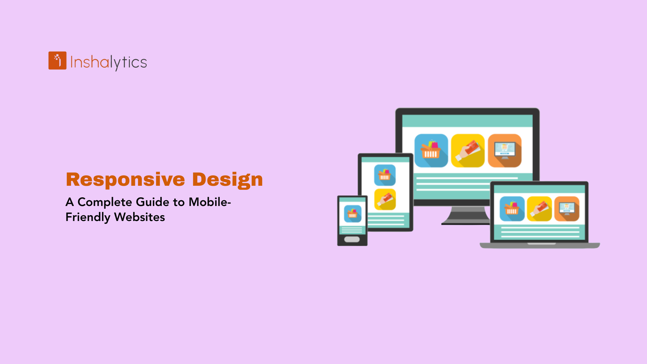
Responsive web design is a web development approach that ensures websites automatically adapt and display optimally across all screen sizes and devices from large desktop monitors to tablets, smartphones, and everything in between. Rather than creating separate versions of a website for different devices, responsive design uses flexible grids, fluid images, and CSS media queries to dynamically adjust layout, content, and functionality based on the user’s screen dimensions and device capabilities.
Introduced by web designer Ethan Marcotte in 2010, responsive design has become the industry standard for modern web development. With mobile devices accounting for over 60% of global web traffic, responsive design is no longer optional it’s essential for user experience, search engine optimization, and business success.
Navigate This Post
How Responsive Design Works
Responsive design relies on three core technical components working together to create seamless experiences across devices.
1. Flexible Grid Layouts
Traditional web designs used fixed pixel widths (e.g., 960px wide). Responsive designs use relative units like percentages or ems that scale proportionally to screen size.
Fixed Layout Example:
.container { width: 960px; }
Responsive Layout Example:
.container { width: 90%; max-width: 1200px; }
The responsive approach creates layouts that expand and contract fluidly rather than breaking or requiring horizontal scrolling on smaller screens.
2. Flexible Images and Media
Images and videos must scale appropriately without exceeding their container width or becoming distorted.
Basic Responsive Images:
img {
max-width: 100%;
height: auto;
}
This ensures images never overflow their containers and maintain proper aspect ratios.
Advanced Techniques:
- Responsive images using srcset attribute for different resolutions
- Picture element for serving different images to different screen sizes
- Lazy loading to improve performance on mobile devices
3. CSS Media Queries
Media queries allow developers to apply different styles based on device characteristics like screen width, height, orientation, or resolution.
Example Media Query:
/* Mobile styles (default) */
.sidebar { width: 100%; }
/* Tablet styles */
@media (min-width: 768px) {
.sidebar { width: 50%; }
}
/* Desktop styles */
@media (min-width: 1024px) {
.sidebar { width: 25%; }
}
Media queries enable progressive enhancement, where layouts become more complex and feature-rich as screen size increases.
Key Principles of Responsive Design
Mobile-First Approach
Modern responsive design typically starts with mobile layouts and progressively enhances for larger screens. This approach ensures:
- Core content and functionality work on the most constrained devices
- Performance is optimized for mobile networks
- Design focuses on essential features first
- Enhancement rather than reduction for larger screens
Fluid Typography
Text size should scale appropriately across devices. Techniques include:
- Relative units (rem, em) instead of fixed pixels
- Viewport-based units (vw, vh) for truly scalable text
- CSS clamp() function for controlled scaling
- Appropriate line length (45-75 characters) across devices
Touch-Friendly Interactions
Mobile users interact through touch rather than mouse clicks, requiring:
- Larger clickable areas (minimum 44×44 pixels)
- Adequate spacing between interactive elements
- Swipe gestures where appropriate
- Visible focus states for accessibility
- Removal of hover-dependent functionality
Content Priority
Different screen sizes require different content hierarchies:
- Most important content appears first on mobile
- Secondary content may be hidden in accordions or menus
- Navigation adapts from horizontal menus to hamburger menus
- Forms simplify on mobile with fewer fields or multi-step processes
Performance Optimization
Mobile devices often have slower connections and less processing power:
- Optimized images with appropriate file sizes
- Lazy loading for below-the-fold content
- Minimized JavaScript and CSS
- Conditional loading of non-essential features
Why Responsive Design Matters
1. Mobile Traffic Dominance
With mobile devices generating over 60% of web traffic globally (and higher in many markets), websites must function perfectly on smartphones and tablets. Non-responsive sites frustrate users and drive them to competitors.
2. SEO and Google Ranking
Google uses mobile-first indexing, meaning it primarily evaluates the mobile version of your site for ranking purposes. Responsive design benefits SEO by:
- Providing consistent content across devices
- Avoiding duplicate content issues from separate mobile sites
- Improving user experience metrics (lower bounce rates, longer sessions)
- Meeting Google’s mobile-friendly ranking factor requirements
- Earning the “mobile-friendly” label in search results
3. Improved User Experience
Responsive sites deliver better experiences by:
- Eliminating horizontal scrolling and zooming
- Ensuring readable text without adjusting zoom
- Making navigation intuitive on any device
- Providing consistent branding across platforms
- Reducing frustration and abandonment
4. Cost and Maintenance Efficiency
Maintaining one responsive site is significantly more efficient than managing separate desktop and mobile versions:
- Single codebase to update and maintain
- Unified content management
- Streamlined testing and quality assurance
- Lower development and hosting costs
- Simplified analytics and reporting
5. Future-Proofing
New devices with varying screen sizes continually emerge (smartwatches, foldable phones, large tablets). Responsive design adapts automatically to new form factors without requiring redesigns.
6. Higher Conversion Rates
Users are more likely to convert on sites that work seamlessly on their devices:
- Easier form completion on mobile
- Smoother checkout processes
- Better product browsing experiences
- Reduced cart abandonment
- Increased customer satisfaction
Responsive Design vs. Alternative Approaches
Adaptive Design
Uses multiple fixed layouts for specific screen sizes rather than fluid scaling. The server detects device type and serves the appropriate layout.
Pros: More control over exact appearance at breakpoints Cons: More labor-intensive, requires maintaining multiple layouts, less flexible
Separate Mobile Site (m.website.com)
Creates an entirely separate mobile website on a subdomain.
Pros: Complete control over mobile experience Cons: Duplicate content management, SEO complications, inconsistent branding, higher costs
Dynamic Serving
Serves different HTML/CSS to different devices from the same URL.
Pros: Device-specific optimization possible Cons: Complex implementation, difficult maintenance, potential SEO issues
Winner: Responsive design offers the best balance of flexibility, maintenance efficiency, and SEO benefits, making it the industry standard.
Common Responsive Design Breakpoints
While breakpoints should be based on your specific design needs, common breakpoints include:
Mobile (Portrait): 320px – 480px
- Single column layouts
- Hamburger navigation
- Touch-optimized spacing
Mobile (Landscape) / Phablets: 481px – 767px
- Slightly wider layouts
- May introduce two-column sections
Tablets (Portrait): 768px – 1024px
- Two to three column layouts
- More complex navigation options
- Sidebar content may appear
Tablets (Landscape) / Small Laptops: 1025px – 1280px
- Multi-column layouts
- Full navigation menus
- More whitespace and breathing room
Desktops / Large Screens: 1281px+
- Maximum layout width (often capped at 1200-1600px)
- Multiple columns and sidebars
- Enhanced visual elements
Testing Responsive Designs
Browser Developer Tools
Modern browsers include responsive design testing modes:
- Chrome DevTools Device Mode
- Firefox Responsive Design Mode
- Safari Responsive Design Mode
These simulate various devices and screen sizes without requiring physical devices.
Online Testing Tools
BrowserStack – Test on real devices in the cloud LambdaTest – Cross-browser responsive testing Responsinator – Quick view across multiple devices Am I Responsive? – Simple visual preview tool
Physical Device Testing
Always test on actual devices when possible:
- Different smartphone models (iOS and Android)
- Various tablet sizes
- Multiple desktop screen resolutions
- Different operating systems and browsers
Key Testing Checklist
✓ Navigation works on all devices ✓ Text is readable without zooming ✓ Images scale properly without distortion ✓ Forms are usable on touchscreens ✓ Buttons and links are easily tappable ✓ Page loads quickly on mobile networks ✓ No horizontal scrolling occurs ✓ Content hierarchy makes sense on small screens ✓ Videos and embedded content display correctly ✓ Shopping carts and checkout processes function smoothly
Best Practices for Responsive Design
1. Start with Mobile-First Design
Design and code for mobile devices first, then enhance for larger screens. This ensures core functionality works on the most constrained environment.
2. Use a CSS Framework (Optional)
Frameworks like Bootstrap, Foundation, or Tailwind CSS provide responsive grid systems and components, accelerating development.
Benefits: Faster development, tested across devices, consistent patterns Drawbacks: Additional code overhead, learning curve, potential generic appearance
3. Optimize Images for Performance
- Use appropriate image formats (WebP for modern browsers)
- Implement responsive images with srcset
- Compress images without quality loss
- Use lazy loading for below-the-fold images
- Consider art direction (different crops for different sizes)
4. Simplify Navigation on Mobile
Transform complex desktop navigation into mobile-friendly alternatives:
- Hamburger menus for extensive navigation
- Priority+ patterns (show most important items, hide rest)
- Tab bars for primary actions
- Search-first navigation when appropriate
5. Consider Touch Target Sizes
Make interactive elements large enough for finger taps:
- Minimum 44×44 pixels for touch targets
- Adequate spacing between clickable elements (8-10px minimum)
- Visual feedback on tap (color change, animation)
6. Test Performance on Real Networks
Use Chrome DevTools network throttling to simulate:
- 3G connections
- 4G connections
- Slow WiFi
Ensure acceptable load times even on slower connections.
7. Implement Flexible Typography
Use relative units and modern CSS techniques:
/* Fluid typography example */
h1 {
font-size: clamp(1.5rem, 5vw, 3rem);
}
This creates text that scales smoothly between defined minimum and maximum sizes.
8. Hide Content Thoughtfully
When hiding content on mobile, ensure:
- It’s truly less important (not just convenient to hide)
- Users can access it if needed (accordion, tabs, “show more”)
- SEO content isn’t completely removed
- Critical conversion elements remain visible
Common Responsive Design Mistakes
Tiny Touch Targets – Buttons and links too small for accurate tapping frustrate mobile users.
Ignoring Landscape Orientation – Many users browse in landscape mode; test both orientations.
Non-Optimized Images – Large images waste data and slow load times on mobile networks.
Broken Forms on Mobile – Complex forms without mobile optimization drive abandonment.
Hiding Important Content – Assuming mobile users don’t want certain content can hurt engagement and conversions.
Too Many Breakpoints – Excessive breakpoints create maintenance nightmares; stick to 3-5 major breakpoints.
Forgetting About Tablet – Tablets require unique consideration, not just scaled-up phone or scaled-down desktop layouts.
Conclusion
Responsive web design has transformed from an optional enhancement to an essential requirement for modern websites. With diverse devices accessing the internet and Google prioritizing mobile-friendly sites, responsive design ensures your content reaches users effectively regardless of how they access it.
The beauty of responsive design lies in its efficiency one website that works everywhere, automatically adapting to provide optimal experiences across the entire device spectrum. By embracing flexible layouts, fluid media, and progressive enhancement through media queries, you create websites that serve users’ needs today while remaining adaptable to tomorrow’s devices.
Successful responsive design requires thoughtful planning, thorough testing, and continuous optimization, but the results improved user experience, better SEO performance, higher conversion rates, and simplified maintenance make it an invaluable investment in your digital presence.
Key Takeaway: Responsive web design is a development approach using flexible grids, fluid images, and CSS media queries to ensure websites automatically adapt and display optimally across all screen sizes and devices. Essential for modern SEO and user experience, responsive design eliminates the need for separate mobile sites while improving performance, reducing maintenance costs, and future-proofing websites against new device formats.


