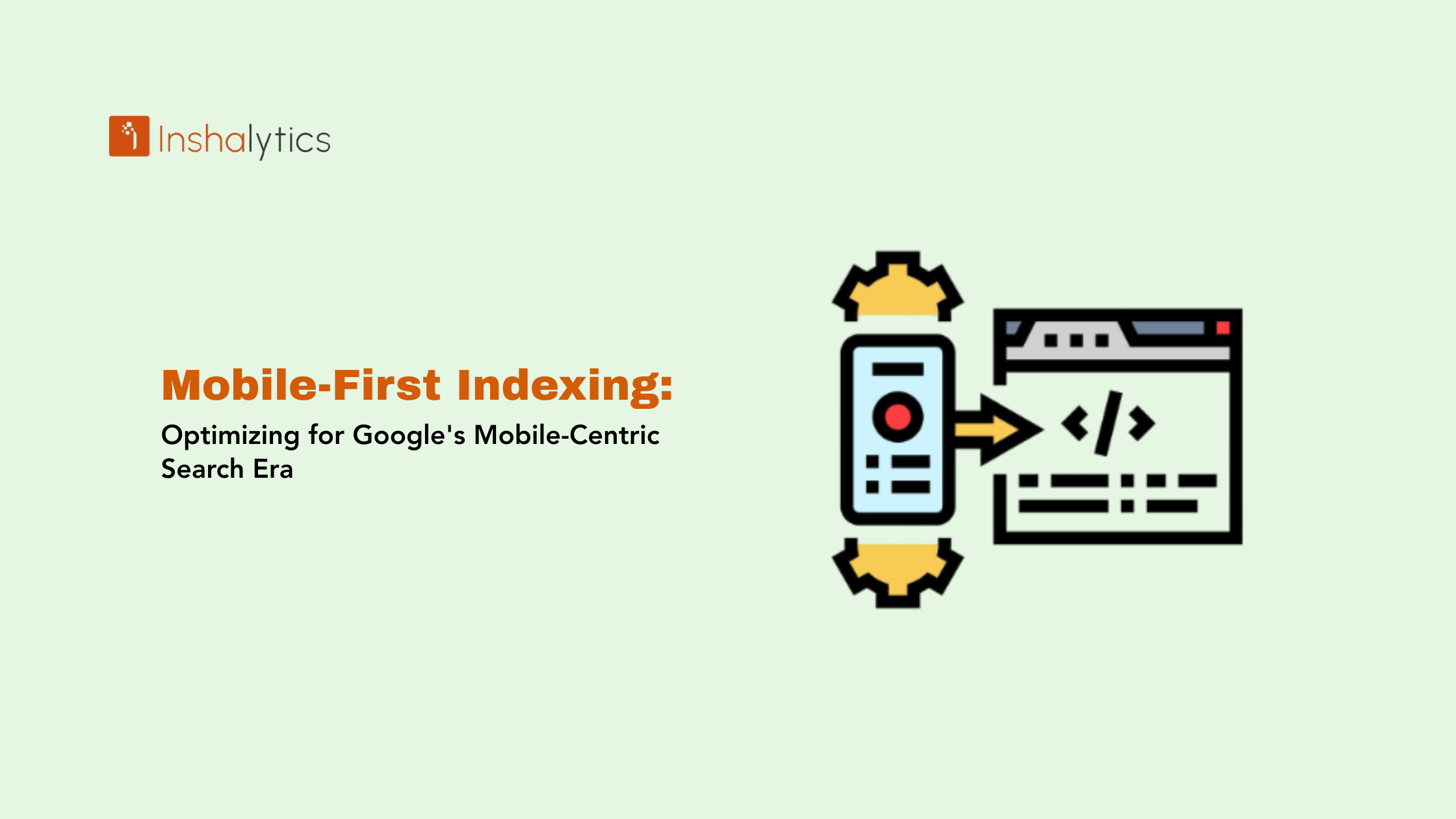
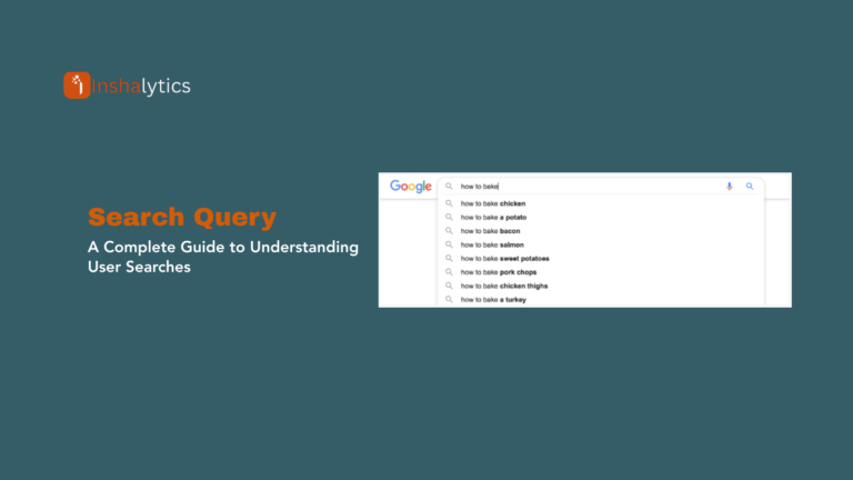
Google now judges your website almost entirely based on how it performs on a smartphone. Not your desktop version. Not how it looks on a widescreen monitor. Your mobile version its content, its speed, its structure is what determines where you rank across every device. That’s mobile-first indexing, and after Google’s March and May 2026 core updates, the stakes have never been higher. Sites with poor mobile experiences are seeing real ranking drops. This guide explains exactly what mobile-first indexing means, how it works in 2026, what the latest updates changed, and the specific steps you need to take to protect and improve your search visibility.
What Is Mobile-First Indexing?
Mobile-first indexing is Google’s approach of using the mobile version of your website as the primary source for crawling, indexing, and ranking across all devices, including desktop.
When Googlebot visits your site, it uses Googlebot Smartphone to evaluate your pages. Whatever that mobile crawler sees the text, images, structured data, internal links, and overall structure becomes the basis for your rankings everywhere. If content exists only on your desktop version but not mobile, Google may not index it at all.
Google announced this shift in 2016, began rolling it out in 2018, and completed the transition for all websites by 2021. As of 2026, there is no opting out. Every website operates under mobile-first indexing.
This is not just a crawling preference; it directly determines what Google indexes and how it evaluates your relevance, authority, and user experience.
Why Mobile-First Indexing Exists
Mobile search has dominated overall search volume for years. In most markets, more than 60% of all searches happen on smartphones. Evaluating sites based on desktop versions while serving mobile users created a fundamental mismatch between what Google indexed and what users actually experienced.
Mobile-first indexing corrects that mismatch. It means Google’s rankings now reflect the version users actually see when they click a result on their phone. It also ensures that mobile-specific experience signals load speed, layout stability, interaction responsiveness factor into rankings based on real mobile behavior, not desktop proxies.
For businesses, this matters beyond SEO. Your mobile site is often the first impression you make on a customer. A slow, cluttered, or content-thin mobile experience doesn’t just hurt rankings it hurts conversions, trust, and revenue.
How Mobile-First Indexing Works in 2026
Understanding the mechanics helps you prioritize the right fixes.
Googlebot Smartphone Is the Primary Crawler
When Google crawls your site, it uses the smartphone user agent as its main evaluation tool. This crawler renders your pages as a mobile browser would it processes CSS, JavaScript, images, and content at mobile screen dimensions and connection speeds.
Content that loads correctly on desktop but breaks on mobile, loads too slowly on mobile, or is blocked from the mobile crawler will not be evaluated or indexed the way you intend.
Mobile Content Determines Rankings Across All Devices
This is the most misunderstood aspect of mobile-first indexing. Your rankings on desktop search results are also based on your mobile version. A visitor searching from a laptop who finds your page and clicks through that ranking was determined by your mobile site’s quality. If your mobile version has less content, missing structured data, or weaker internal linking than your desktop version, your desktop rankings suffer too.
Core Web Vitals Are Measured on Mobile
Core Web Vitals LCP, INP, and CLS are measured based on mobile user experience. After the March 2026 core update, Google increased the weight placed on these signals, particularly on touch-friendly navigation and mobile-specific performance metrics. A site that scores well on desktop but poorly on mobile is at a meaningful disadvantage.
Responsive Design Gets the Smoothest Indexing
Sites using responsive design one URL, one HTML file, CSS that adapts to screen size give Google the simplest crawling path. There’s no ambiguity about which version to index because both versions are the same underlying content. For most sites, this is the right approach.
What the 2026 Google Core Updates Changed
The March and May 2026 core updates introduced several shifts that directly affect how mobile-first indexed sites perform.
Content Depth Matters More Than Volume
The 2026 updates now better identify and reward content that demonstrates genuine expertise and provides comprehensive answers to user queries. Thin content and AI-generated articles without human oversight are being penalized more aggressively. For mobile-first indexing specifically, this means your mobile version needs to carry the full depth of your content not a truncated summary.
Mobile UX Signals Carry More Weight
Google has updated how it evaluates mobile user experience, placing greater emphasis on touch-friendly navigation and mobile-specific performance metrics. Intrusive popups, cramped tap targets, and horizontal scrolling that were tolerated before are now more likely to suppress visibility.
Page Experience Affects Competitive Position
Slow pages, intrusive layouts, ad-heavy templates, poor mobile usability, thin intros before the answer, and cluttered structure all make content feel less satisfying. Usability issues can still influence whether a result feels worth surfacing. If the page technically answers the query but frustrates the user, that weakens its competitive position.
People-First Content Rewarded
Google’s guidance continues to push site owners toward helpful, reliable, people-first content instead of content made mainly to rank. For mobile-first indexed sites, this means content that genuinely serves the reader at every scroll depth, not just keyword-optimized paragraphs above the fold.
Requirements for Mobile-First Indexing Success
These are the non-negotiable elements Google checks when evaluating your mobile version.
Content Parity Between Mobile and Desktop
Every piece of content on your desktop version must exist on mobile. This includes body copy, headings, images, videos, and structured data. Tabs, accordions, and “read more” toggles that hide content on mobile create risk: Google may crawl the collapsed content but assign it lower weight.
The fix: audit your mobile and desktop versions side by side. Use Google’s URL Inspection tool in Google Search Console to see exactly what Googlebot Smartphone rendered on any given page.
Metadata Consistency
Title tags, meta descriptions, and canonical URLs must match between versions. Discrepancies signal inconsistency and can confuse Google about which version represents your canonical content. If you’re on responsive design, this is handled automatically but if you run a separate m-dot site, audit every page.
Structured Data Must Appear on Mobile
Schema markup that exists on desktop but is absent from mobile versions means you’re ineligible for the rich results those schemas would earn. Article schema, FAQ schema, breadcrumb markup, review markup verify all of it renders correctly on mobile using the Rich Results Test.
Internal Links Must Exist on Mobile
Your mobile navigation and in-content internal linking strategy determines how Google discovers and interprets your site structure. If your mobile version strips out contextual links that desktop has, you’re weakening your crawl graph and topical signals. Check that your mobile hamburger menu, footer links, and in-article links are fully accessible to Googlebot.
Images Must Be Accessible and Optimized
Images on your mobile version need properly written alt text, accessible URLs (not blocked by JavaScript or lazy loading that the crawler can’t execute), and appropriately compressed file sizes. Large uncompressed images are one of the biggest contributors to poor LCP scores on mobile.
Common Mobile-First Indexing Problems
These issues appear most frequently during technical SEO audits.
Different Content on Mobile vs. Desktop
Some themes and page builders render abbreviated content on mobile: shorter intros, fewer sections, images that swap out. If your mobile version shows a condensed version of what desktop shows, that condensed version is what Google indexes. Audit with the URL Inspection tool and compare the rendered HTML output.
Blocked Resources on Mobile
CSS, JavaScript, and image files that are blocked via robots.txt prevent Google from rendering your pages correctly. Run a Coverage report in Search Console and check for “Blocked by robots.txt” issues. Ensure your robots.txt allows Googlebot access to all resources needed to render mobile pages.
Separate Mobile URLs Without Proper Configuration
If you run an m.example.com setup, you need bidirectional annotations: rel=”canonical” on mobile pages pointing to desktop, and rel=”alternate” on desktop pages pointing to mobile. Missing or incorrect annotations create duplicate content issues and can split ranking signals. Also verify that 301 redirects are serving mobile users to the mobile version correctly.
Slow Mobile Performance
Page speed penalties hit harder on mobile because connection speeds vary more than on desktop. The goal for LCP on mobile is under 2.5 seconds. For INP, under 200 milliseconds. For CLS, under 0.1. If you haven’t run a CrUX report or PageSpeed Insights on your mobile URL recently, do it today Core Web Vitals thresholds are now weighted more heavily after the 2026 updates.
Intrusive Interstitials on Mobile
Pop-ups that cover the main content on mobile trigger a specific penalty from Google. Full-screen newsletter overlays, app download prompts, and GDPR banners that occupy more than a reasonable viewport area on mobile can suppress rankings. The rule: interstitials that make content inaccessible before users can interact with the page are penalized.
How to Check Your Mobile-First Indexing Status
URL Inspection Tool in Search Console
Open Google Search Console and use the URL Inspection tool on your most important pages. After requesting the live test, look at the “Crawled as” field it should show Googlebot Smartphone. The rendered screenshot shows you exactly what Google sees on mobile.
Crawl Stats Report
In Search Console, go to Settings → Crawl Stats. Check the User Agent breakdown. For mobile-first indexed sites, Googlebot Smartphone should represent the overwhelming majority of crawl requests. If desktop Googlebot dominates, something may be misconfigured.
PageSpeed Insights (Mobile Tab)
Run your key pages through PageSpeed Insights and analyze the Mobile tab specifically. This shows real-world Core Web Vitals data from the Chrome User Experience Report (CrUX), not just lab data. Field data is what Google uses for rankings.
Mobile-Friendly Test
Google’s Mobile-Friendly Test at search.google.com/test/mobile-friendly renders your page as Googlebot Smartphone sees it and flags usability issues: text too small, tap targets too close, viewport not configured. Fix every flagged item.
Rich Results Test
For any page with structured data, run the Rich Results Test and verify the schema renders correctly at mobile dimensions. Check especially for JSON-LD blocks that may be conditionally loaded based on user agent.
How to Optimize for Mobile-First Indexing
Implement Responsive Design as Your Foundation
If you’re still running a separate mobile site or using dynamic serving, evaluate whether migrating to responsive design makes sense. Responsive sites eliminate an entire category of mobile-first indexing configuration errors. They’re also easier to maintain, faster to update, and Google’s stated preferred configuration.
Audit Every Page for Content Parity
Use a crawl tool to compare desktop and mobile rendered HTML for your most important pages. Look specifically at word count differences, heading structure, structured data blocks, and internal link counts. Any page where mobile has substantially less than desktop is a ranking risk.
Fix Core Web Vitals on Mobile First
Prioritize Core Web Vitals improvements on mobile over desktop. The highest-impact fixes are:
- LCP: Convert images to WebP, implement proper srcset for mobile, use a CDN, and preload hero images.
- INP: Reduce JavaScript execution time, defer non-critical scripts, break up long tasks.
- CLS: Set explicit width and height on images and embeds, avoid injecting content above existing page elements.
Optimize Mobile Navigation and Internal Linking
Your mobile navigation needs to expose the same topical depth as your desktop nav. Ensure your hamburger menu gives Googlebot access to all main categories and service pages. Within article content, preserve all contextual internal links; don’t let responsive CSS hide or disable them at mobile breakpoints.
Verify Structured Data on Mobile
After any site update or theme change, retest your key pages with the Rich Results Test. JSON-LD is the most resilient format for structured data because it lives in the document head and doesn’t depend on DOM rendering. If you’re using microdata or RDFa in the HTML body, ensure those elements render on mobile.
Monitor Mobile-Specific Performance in Search Console
Filter Search Console data by device type. Compare mobile impressions, clicks, CTR, and average position against desktop. Significant gaps between mobile and desktop performance often indicate mobile-specific indexing or usability issues. Set up regular reviews, especially in the weeks after Google core updates.
Mobile-First Indexing and Different Site Configurations
Responsive Design (Recommended)
One URL, one HTML file, CSS media queries handle layout changes. Google crawls once and understands the full content. No configuration overhead. Ensure your responsive breakpoints render all content correctly; test at 375px, 414px, and 768px widths specifically.
Separate Mobile URLs (m.example.com)
Requires: canonical tags on mobile pointing to desktop, rel=”alternate” on desktop pointing to mobile, correct redirect logic for mobile users, and full content parity between versions. This configuration has the highest error rate and is worth migrating away from if your site traffic justifies the effort.
Dynamic Serving (Same URL, Different HTML)
Requires proper Vary: User-Agent HTTP headers, consistent content across versions, and careful user agent detection. Cloaking serving different content to Googlebot than to users violates Google’s policies. This configuration is increasingly uncommon and not recommended for new site builds.
AMP Pages
If you’re using AMP, ensure rel=”amphtml” exists on canonical pages and rel=”canonical” exists on AMP versions. AMP pages must carry the same structured data, content depth, and metadata as canonical pages.
Mobile-First Indexing vs. Mobile-Friendly: The Distinction That Matters
These terms are related but not interchangeable, and confusing them leads to incomplete optimization.
Mobile-friendly describes whether a site provides a good experience on mobile devices: readable text, accessible navigation, no horizontal scrolling. It’s a ranking signal.
Mobile-first indexing describes how Google crawls and evaluates your site using the mobile version as the primary content source. It’s an indexing methodology, not a ranking factor itself.
A site can pass mobile-friendly checks but still have mobile-first indexing problems if the mobile version has less content than desktop. Conversely, a site could have full content parity but fail mobile-friendliness due to poor UX. Both need to be correct.
Mobile-friendliness affects user experience signals and ranking as a direct factor. Mobile-first indexing determines what content Google evaluates when applying all other ranking factors. You need to address both.
What Google’s 2026 Updates Mean for Your Mobile SEO Strategy
The March and May 2026 core updates did not change the fundamentals of mobile-first indexing but they raised the bar for what “good enough” means.
Sites that reduced ad clutter, added jump navigation and improved mobile speed saw measurable ranking gains after December 2025. That pattern has continued into 2026. The practical implication: mobile optimization is no longer just a technical compliance exercise. It’s a competitive differentiator.
Make sure every important page gives users a clear reason to stay, read, trust your business, and take action. On mobile, this means faster load times, cleaner layouts, content that answers the query without making the user scroll past preamble, and navigation that doesn’t require precision tapping on small elements.
For local businesses in particular the trades, healthcare, professional services mobile is where your customers are searching. Someone searching “emergency plumber near me” at 10pm is on a phone. A site that loads in 5 seconds and buries the phone number below three paragraphs of marketing copy loses that job to a competitor whose mobile experience is tighter.
Need help auditing your mobile performance and building an SEO strategy that generates actual booked jobs? Contact the Inshalytics team we specialize in technical SEO and lead generation for local service businesses.
The Future of Mobile-First
Mobile-first indexing is now simply how the web works. The evolution happening on top of it includes:
INP replacing FID as the Core Web Vitals interactivity metric has already rolled out. Sites that optimized for FID need to retest with INP benchmarks it measures a broader range of interactions and is harder to pass.
AI-powered search features including AI Overviews are predominantly consumed on mobile. Structured, scannable content that directly answers queries is better positioned for both traditional rankings and AI-generated summaries.
Voice search on mobile continues growing for local intent queries. Content that mirrors natural spoken questions and provides clear, direct answers is better positioned for these searches.
Technical SEO foundations become more important as the ranking environment grows more competitive. Sites with clean website indexability, proper canonical structure, and optimized crawl budget give every piece of content the best possible chance of being indexed and ranked.
Conclusion
Mobile-first indexing is the foundation that every other SEO effort rests on. Google uses your mobile version to evaluate your content, structure, performance, and user experience, and those evaluations determine your rankings across every device, every search, every query. After the March and May 2026 core updates, the margin between sites that have this right and sites that don’t is widening.
The core requirements haven’t changed: content parity between mobile and desktop, fast Core Web Vitals on mobile, responsive design or properly configured alternative configurations, consistent structured data and metadata, and a mobile user experience that serves readers without friction. What has changed is how aggressively Google surfaces sites that get this right and demotes sites that don’t.
Start with a mobile audit in Search Console. Use the URL Inspection tool on your five most important pages. Check your Core Web Vitals field data on mobile. Fix what’s broken before building on top of it. Ready to turn your website into a consistent source of inbound leads? Get in touch with Inshalytics and let’s build a mobile-first SEO strategy that converts.